Case Study · UX/UI Design · Web
Bringing the Museum Online
A responsive, mobile-first website that makes planning a museum visit effortless — built as the web companion to the MoPho app.

Overview
Problem & Goal
The website carried the most traffic but offered the least clarity. The goal was to make planning a visit effortless on every screen.
Problem
- Key details buried across deep, inconsistent pages
- Layouts that broke or felt cramped on phones
- Visitors leaving to find hours and tickets elsewhere
- No clear hierarchy between “what’s on” and “how to visit”
Goal
- One obvious place to plan a visit
- Mobile-first layouts that scale to any device
- Make “What’s on” and “Visit” the fastest paths
- A calm, content-first hierarchy that lets photography lead
Context
If the website is where most visits begin, then a confusing website doesn’t just lose clicks — it loses visits.
Research
Where visits begin
The majority of sessions start on a phone. Desktop is a minority — and tablet is a rounding error. Mobile-first isn’t a preference here, it’s the baseline.
- Mobile64%
- Desktop28%
- Tablet8%
Representative device split for cultural-sector websites, based on aggregated public web-traffic benchmarks.
How visitors arrive
Most people land via search or come directly — often looking for a single fact. The homepage can’t assume context; every entry point has to orient quickly.
- Organic search46%
- Direct24%
- Social20%
- Referral10%
Typical acquisition mix for museum websites: organic search, direct, social, and referral.
Web behaviors
On a museum site, people behave like they’re completing a task — quickly, on a small screen, with little patience for hunting.
Research highlights
Key insights
- The website — not the app — is the primary planning channel
- Mobile is the default context, so layouts must be designed up from small screens
- A handful of tasks (hours, tickets, what’s on, getting there) dominate intent
- Scattered information and weak hierarchy are the real usability problem
- Speed and clarity matter more than richness — content should lead, chrome should recede
Audience

Art enthusiast
Returns often, follows the programme
Checks the site regularly for new exhibitions and events.
Wants an up-to-date “What’s on” and an easy way to see what’s coming next.

Tourist
First-time visitor, short on time
Plans a one-off visit, often on a phone while travelling.
Needs hours, location, prices, and tickets in seconds — no friction.
Family visitor
Planning a day out
Coordinates a visit around children and practical logistics.
Looks for family info, accessibility, facilities, and clear directions.
Educator
Organising a group
Researches the museum for a class or group booking.
Needs group options, educational resources, and a way to get in touch.
Information architecture
Primary navigation
Five top-level sections, each tied to a real visitor goal. Everything else nests cleanly underneath.
What’s on
Current and upcoming exhibitions and events — the museum’s living content, surfaced first.
Visit
Hours, prices, tickets, location, accessibility, and facilities — the practical core of every visit.
Exhibitions
A browsable archive of past and present shows, with rich imagery and detail pages.
About
The museum’s story, spaces, and team — context for those who want to go deeper.
Tickets
A persistent, always-visible path to booking — the site’s single most important action.
A navigation that scales
User journey
Key pain points
- Essentials (hours, price, address) were not visible without scrolling and searching
- “What’s on” and “Visit” competed for attention instead of complementing each other
- The ticketing handoff broke the visual and mental flow
- On mobile, long pages and small tap targets made quick checks frustrating
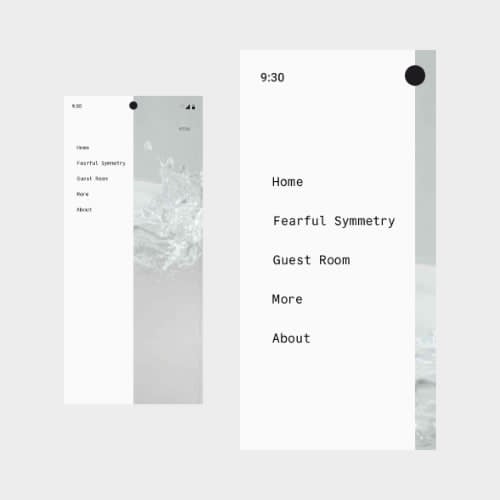
Responsive strategy
Breakpoints
A simple, content-driven set of breakpoints rather than device-specific guesses. Layouts reflow where the content needs it, not where a particular phone happens to end.
Mobile · up to 640px
Single column, full-screen navigation, sticky ticket button, large tap targets.
Tablet · 640–1024px
Two-column grids for exhibitions and cards; the top bar returns.
Desktop · 1024–1440px
Three- and four-column grids, generous spacing, full editorial layouts.
Wide · 1440px+
Constrained content width with breathing room so imagery never overstretches.
Mobile-first, by design
Designing up from the phone forces ruthless prioritisation — and that discipline makes the desktop experience better too.
On mobile
- One column, one clear action per screen
- Essentials pinned and always reachable
- Full-screen menu, thumb-friendly targets
- Images sized for fast loading first
On desktop
- Multi-column editorial grids
- Side-by-side “What’s on” and “Visit”
- Persistent top navigation and search
- Larger imagery without losing rhythm
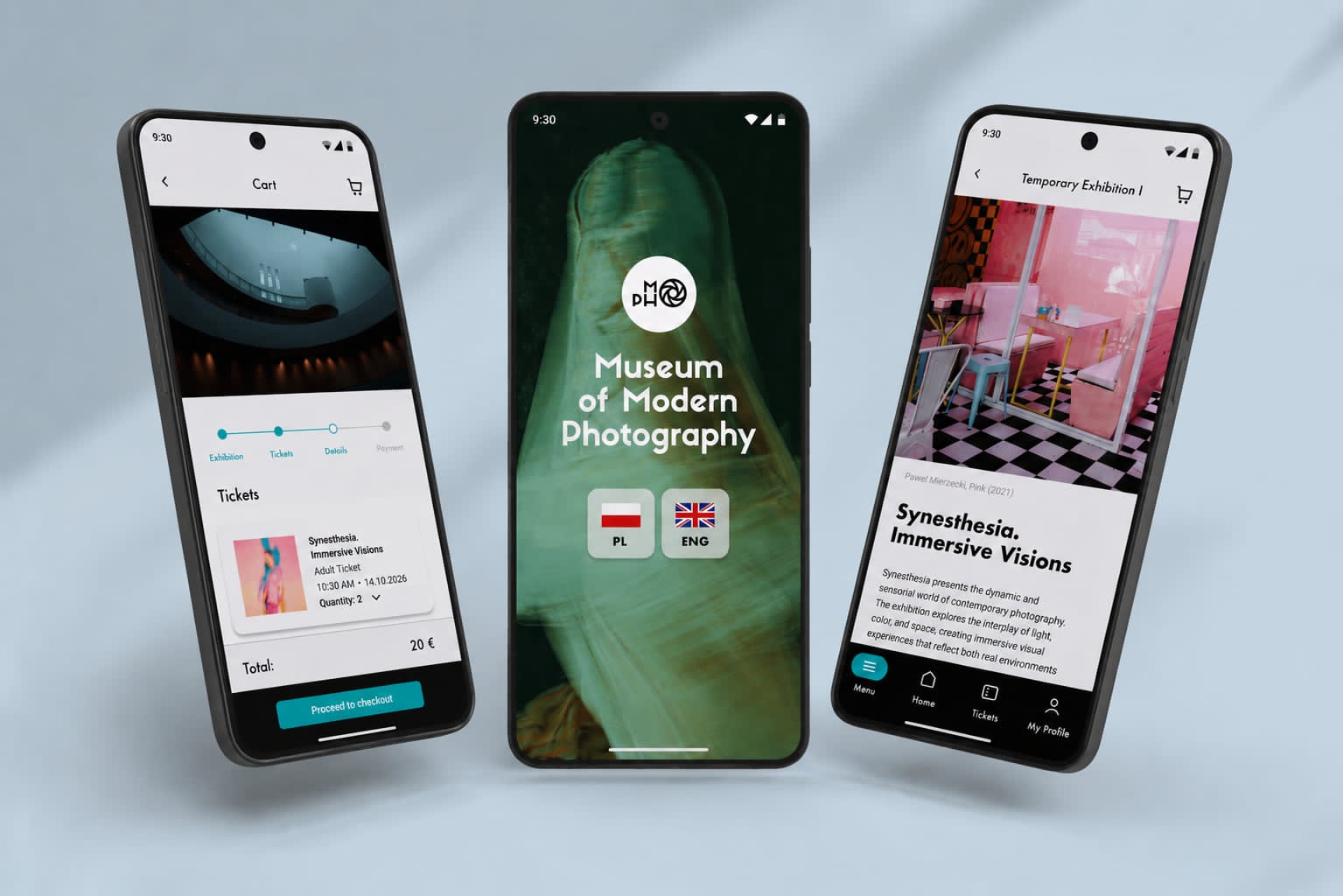
Solution
A content-first homepage
Wireframes
Final design
Exhibitions, front and centre
Design system
A lightweight, responsive system shared with the MoPho app for a consistent brand across channels.
The website extends the MoPho design language into a fluid, responsive system rather than a fixed grid.
Foundations
• A neutral base keeps photography the focal point; teal (#2EC4B6) signals actions, warm pink (#FBC4D8) highlights temporary or dynamic content.
• A geometric display typeface for headlines pairs with a highly legible sans for body, both set on a responsive type scale that uses fluid clamps instead of fixed sizes.
• A 4-pt spacing system and a 12-column fluid grid that collapses to 1–2 columns on small screens.
Responsive decisions
• Components are defined once and adapt by breakpoint — cards, navigation, and grids all share the same tokens.
• Touch targets, spacing, and image sizes are tuned mobile-first, then relaxed on larger screens.
• The system is a scalable foundation shared with the app, not a separate component library.
Key features
What the site does best
Every feature maps back to a visitor goal surfaced in research.
Responsive navigation
One structure across breakpoints — a top bar on desktop, a full-screen menu on mobile, with tickets always in reach.
“What’s on” grid
An image-led, adaptive grid that makes the live programme the first thing visitors see.
Plan your visit
Hours, prices, accessibility, and directions consolidated into one scannable, mobile-friendly page.
Persistent tickets
A standing call to action that keeps the museum’s most important conversion one tap away.
Components & responsive patterns
Core patterns
Adaptive navigation
Top bar ↔ full-screen menu, sharing one information architecture and one standing ticket action.
Exhibition cards
Image, title, and dates in a flexible card that reflows from one to four columns.
Fluid grids
A single 12-column grid that collapses gracefully instead of multiple fixed layouts.
Sticky ticket CTA
A persistent, thumb-reachable action on mobile that never scrolls out of view.
Accessibility
Inclusive by default
Accessibility was treated as a baseline, not a final pass — and many of the choices that help assistive-tech users also make the site faster and clearer for everyone.
Colour & contrast
Text and interactive states meet WCAG AA contrast on every background.
Keyboard & focus
Full keyboard navigation with clear, visible focus states throughout.
Semantic structure
Meaningful headings, landmarks, and alt text so screen readers can navigate easily.
Responsive a11y
Generous tap targets, scalable text, and layouts that survive 200% zoom.
Performance
Performance targets
Speed treated as a design constraint, not an afterthought.
Testing & iteration
Sticky ticket action
On long mobile pages, the path to tickets scrolled out of reach. Pinning a compact “Tickets” button to the bottom of the screen kept the museum’s key conversion available at all times.
Essentials above the fold
First tests showed people scrolling and searching for hours and prices. I moved a condensed “plan your visit” strip directly beneath the hero so the most-asked questions are answered before any scroll.
Exhibition cards
Early cards showed too little to act on. Adding dates and a clearer affordance let visitors scan the programme and decide without opening every detail page.
Outcome
At a glance
Designed against the goals set at the start of the project.
Learnings
What I’d take forward
- Designing up from the phone forces the clarity that benefits every screen
- On content sites, information architecture is the design — visuals come after structure
- A handful of high-intent tasks deserve most of the attention
- Performance and accessibility are UX, not finishing touches
- Sharing one design system across app and web keeps the brand coherent and the work faster