Case Study · Portfolio Website

A quiet portfolio for a photographer

A minimalist portfolio for a photographer and visual artist, designed around silence, rhythm, and typography.
Role
Design & Development
Discipline
UX Design · Art Direction · UI Design · Front-end
Duration
3 weeks
Year
2025

Overview

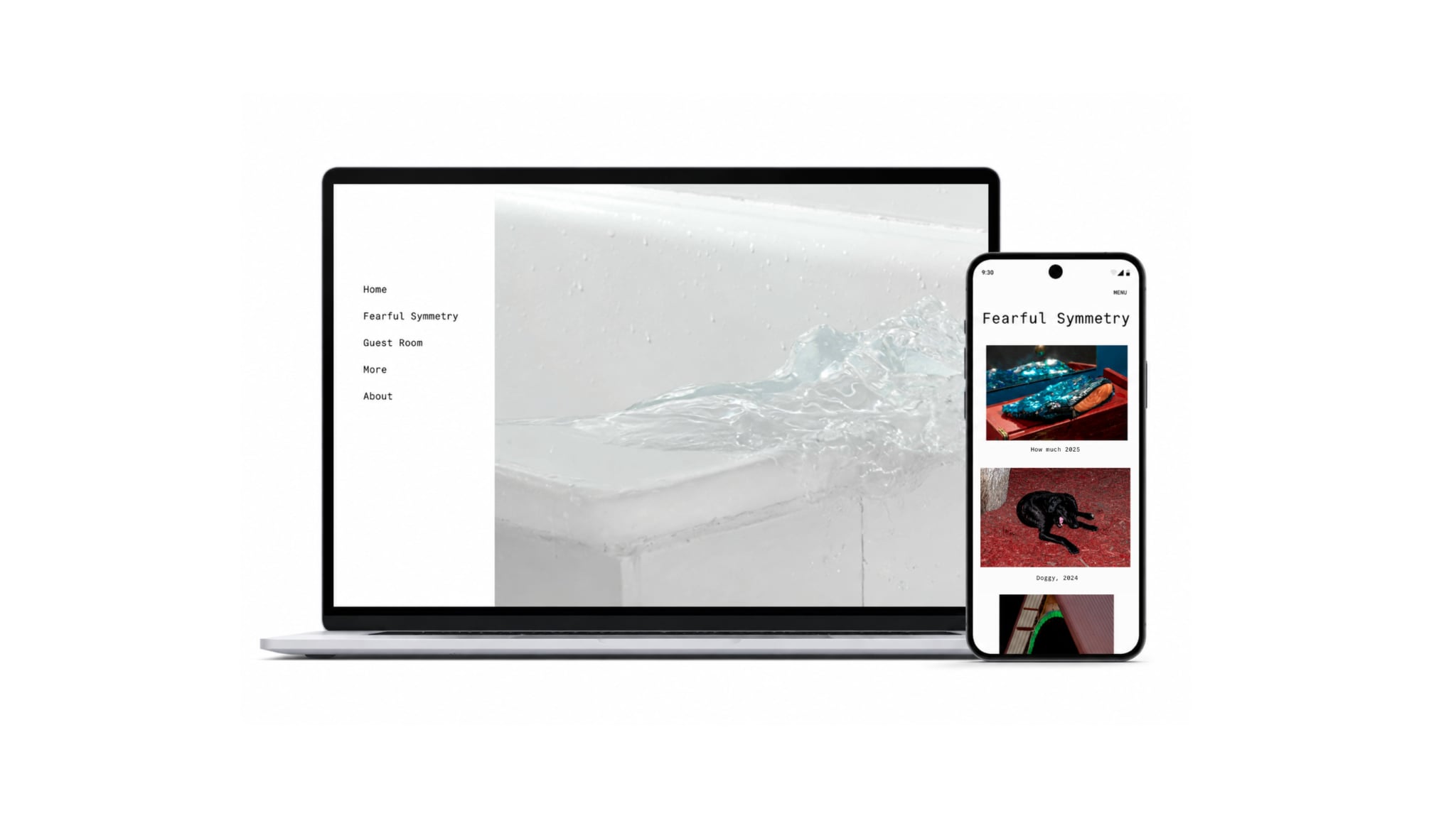
The goal was to create a digital space that frames the work through a thoughtful structure, allowing the photography to remain the central focus.
The goal was to design a website that would not compete with the photography itself, but instead function as a quiet digital exhibition space — restrained, minimal, and almost invisible.
Navigation, typography, and rhythm work together to support slow, contemplative image consumption.

Challenge & Approach

Slow, focused image consumption guided by deliberate restraint.

Challenge

  • A typical portfolio overpowers the imagery
  • Loud UI distracts from the work
  • Photo collections need room to breathe

Approach

  • Pull the interface back to the essentials
  • Treat typography as structure, not decoration
  • Create a gallery-like browsing rhythm

Project scope

  • Minimalist homepage
  • Photographic collections
  • About page
  • Desktop and mobile versions

Experience Principles

Designed for slow, focused viewing, with the interface reduced to essentials
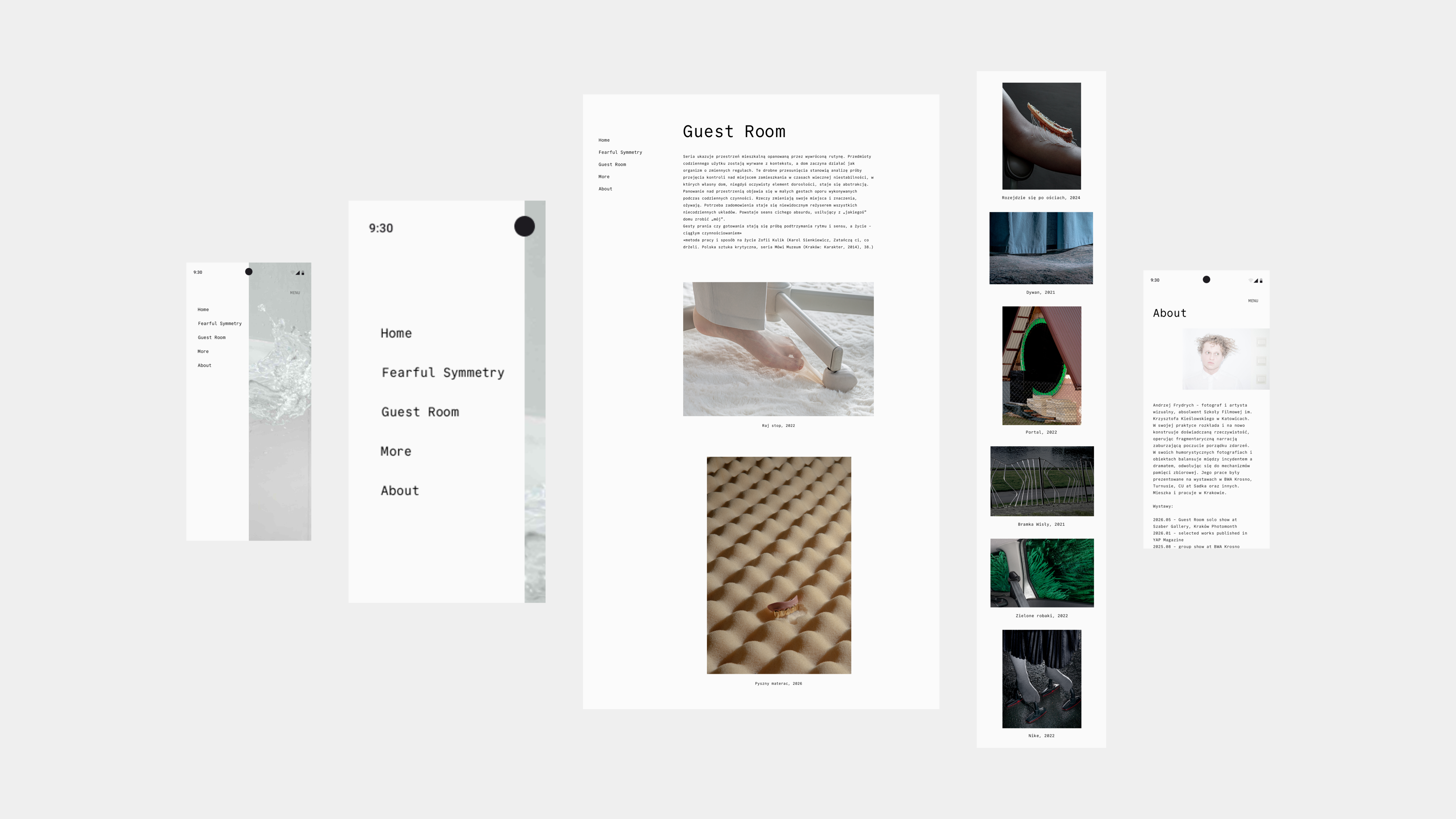
The project was designed around a slower, more focused way of experiencing photography. Navigation, spacing, and scrolling behavior were carefully structured to create a clear rhythm and intentional pacing between images. The experience draws from gallery visits and printed publications, where the viewer controls the pace of discovery. Every design decision was made to support orientation and focus, keeping the interface functional while allowing the photography to lead.
Navigation and menu — minimal editorial design

Design Direction

Designing Silence

The design is built around generous negative space, repetitive rhythm, and a deliberately restrained visual hierarchy. Typography functions as a structural element, organizing content without competing with the imagery. The visual language relies on careful reduction, allowing the composition, spacing, and relationships between images to define the experience. The overall direction draws closer to editorial publications and exhibition archives than to a conventional portfolio website.
Homepage — desktop view

Design principles

Four anchors that shape every screen

Silence

Negative space treated as a primary design element, never as empty space

Rhythm

A consistent vertical cadence that frames each image as a distinct moment

Typography as structure

A monospaced typeface establishing the editorial grid for the entire site

Breathing room

Generous spacing keeps the interface unobtrusive and lets the photography take focus

Design System

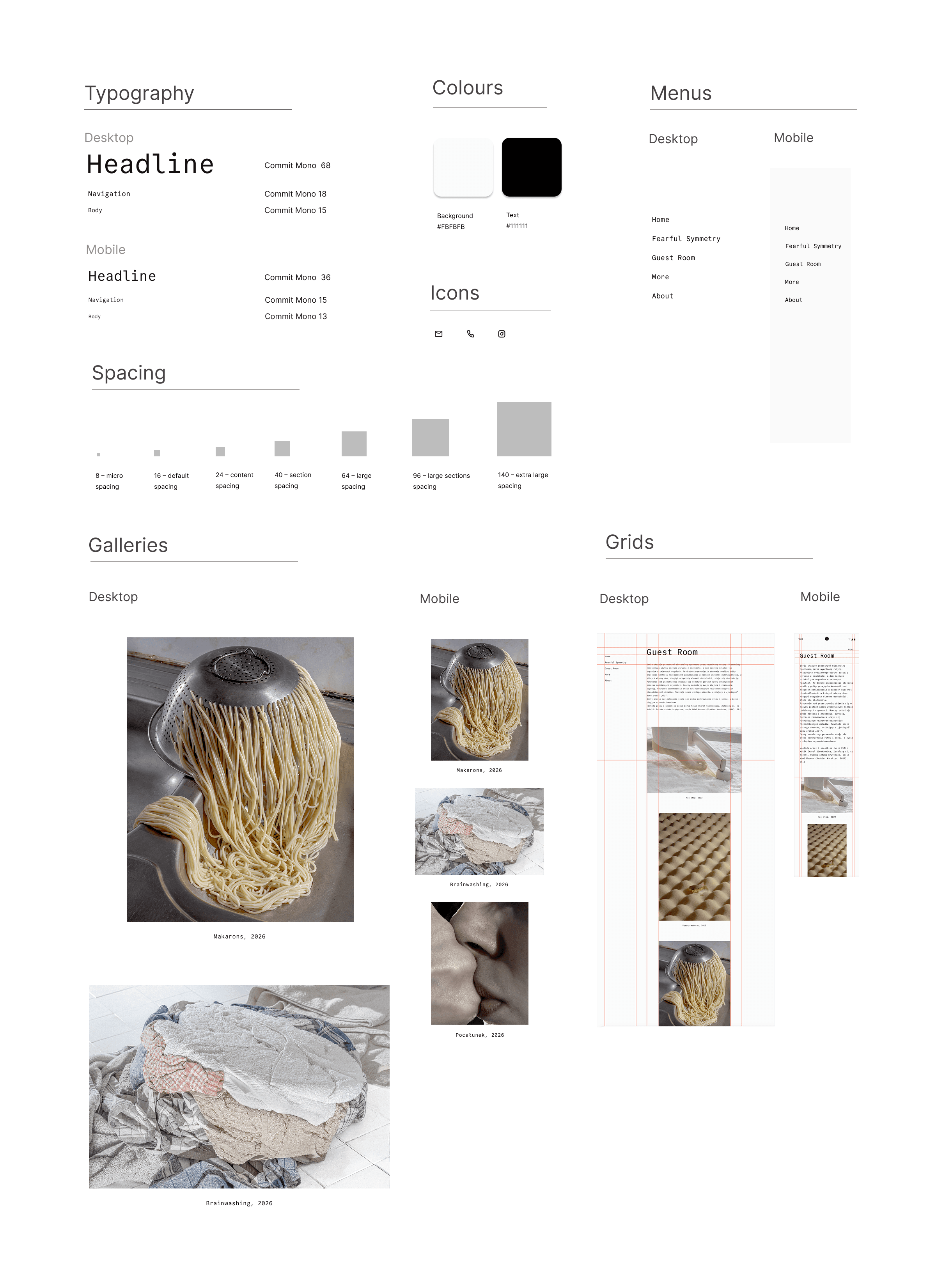
A small system that gets out of the way
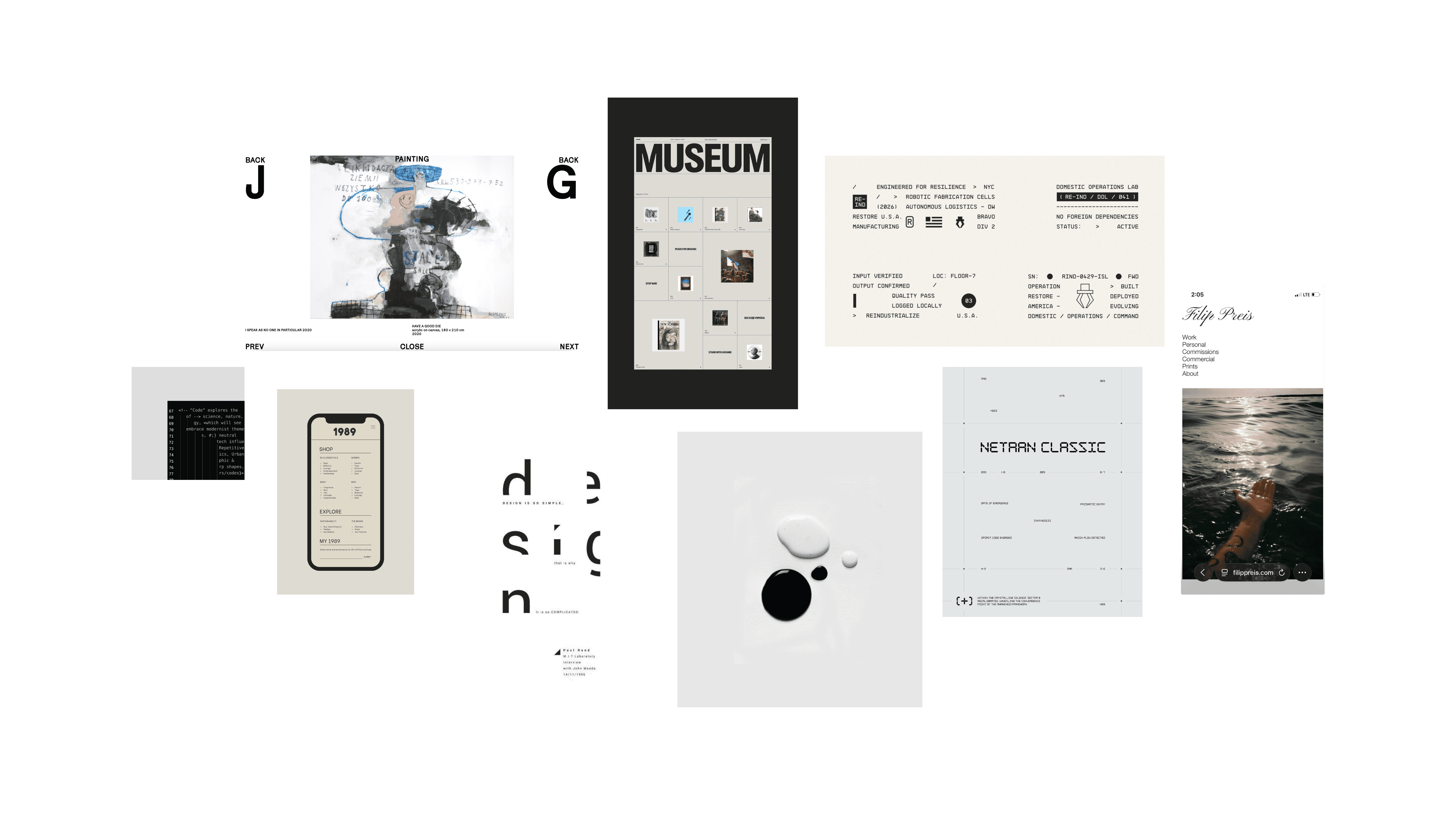
Visual inspiration — gallery and editorial references
The visual direction draws from contemporary art portfolios, gallery archives, and editorial design principles
A deliberately small system — no decorative elements, accent colors, or unnecessary components.

The monospaced typeface establishes a strict editorial grid and gives the project a quiet, archival character.

Vertical rhythm is built on a single spacing unit, repeated and scaled to maintain consistency across the layout.

Responsive but Quiet

A mobile experience that keeps its composure

Mobile preserves the atmosphere
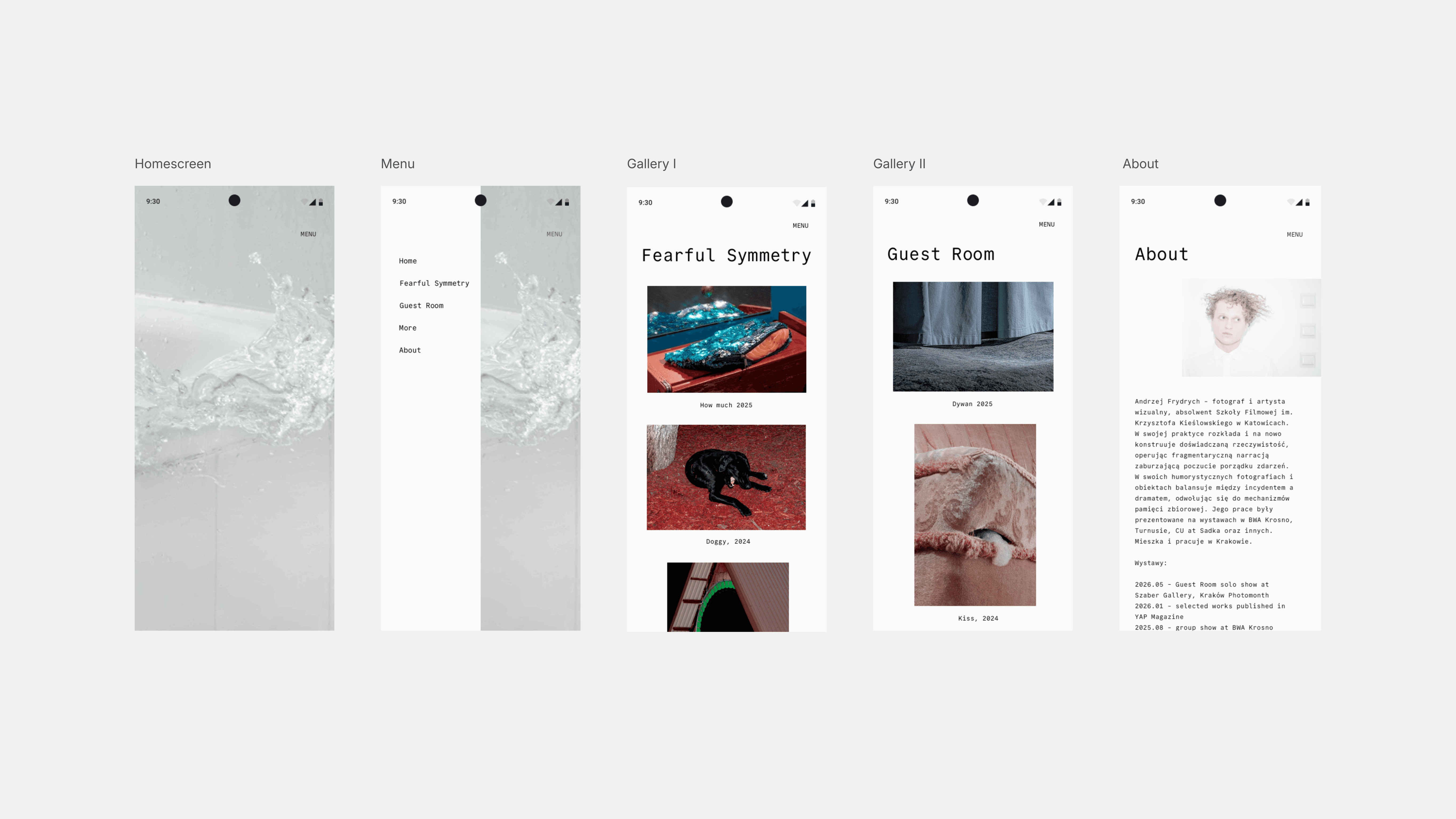
Spacing, rhythm, and typographic restraint carry into mobile screens with intention. Breathing room is preserved, images remain the focal point, and the browsing experience stays intimate rather than cramped.

An Editorial Experience

A refined digital space where the interface quietly supports the photographic narrative.
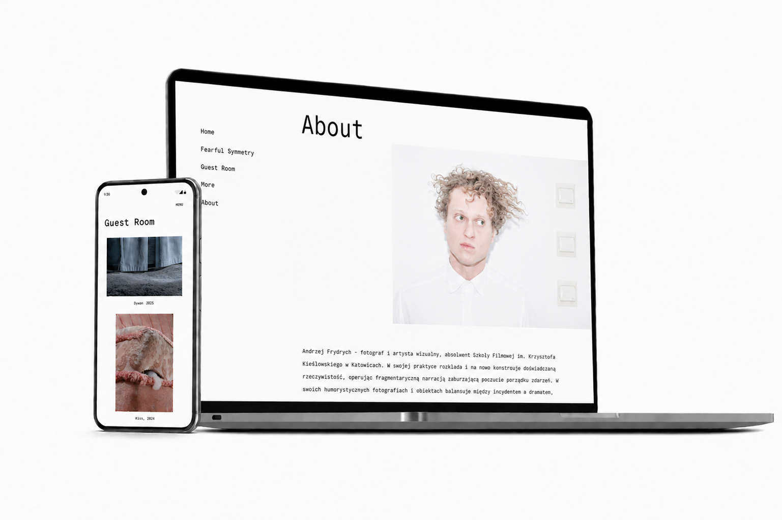
Final outcome — selected screens
The final result feels less like a conventional portfolio website and more like a small digital publication: carefully paced, composed, and shaped by the relationship between images, structure, and rhythm.

Learnings

What this project sharpened in my practice

  • Restraint is a design decision — not the absence of one
  • Typography can carry a layout on its own when given enough room
  • Negative space defines hierarchy as strongly as scale does
  • Editorial pacing translates beautifully into digital products
Contact

Let's start creating together

Let's talk